This blog is part of a series related to Gov 1347: Election Analytics, a course at Harvard University taught by Professor Ryan D. Enos.
At the moment, that’s how much time is left until November 3, 2020 – Election Day. Usually around this time, the party candidates are traveling across the country, busy trying to win voters over and hosting their campaign rallies. However, the Covid-19 pandemic has completed changed how candidates are campaigning.
But, that is not the focus of this series of blogs. From now until November 3, I will be updating this weekly blog series with my 2020 US presidential election prediction model. For this first blog, I’ll be exploring past election results to find any trends in the data. More specifically, I’ll be looking at incumbency advantage, the electoral college, and swing states.
Incumbency Advantage
The first thing I’ll be looking at in this blog is incumbency advantage. There has already been lots of research done surrounding incumbency advantage and its benefits in elections. Specifically in regards to presidential incumbency advantage, David R. Mayhew’s 2008 paper looked at incumbents’ gained experience in office, previous campaign experience, and a few other factors as the underlying reason behind the term “incumbency advantage” in presidential elections.
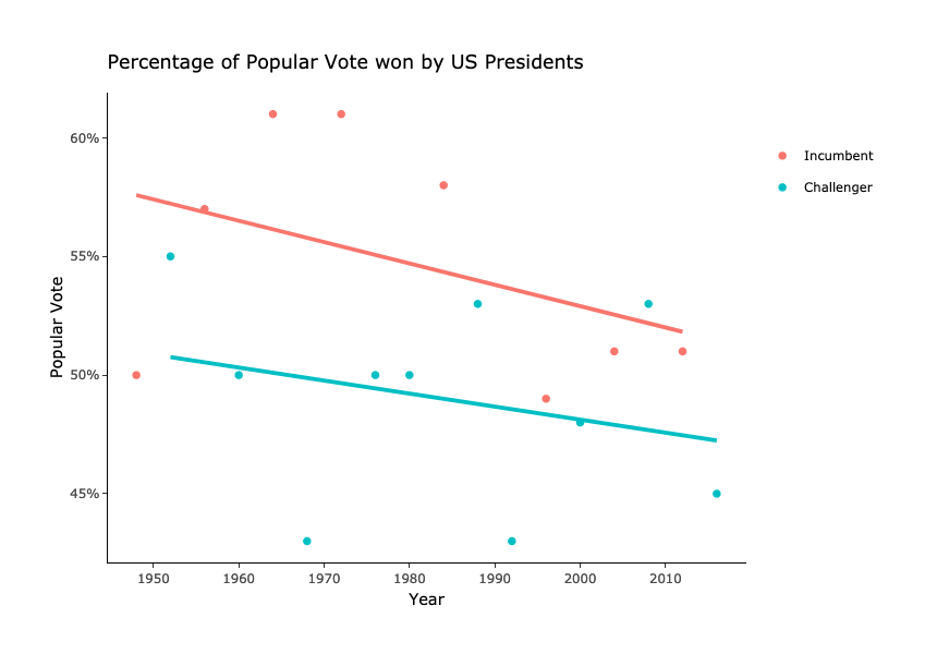
I looked at popular vote data from presidential elections between 1948 to 2016 in the visualization above. It shows that incumbent presidents, in general, tend to win a greater percentage of the popular vote than challengers. The four incumbents that won more than 55% of the popular vote as shown are Eisenhower, LBJ, Nixon, and Reagan. Challengers tend to have a lower popular vote, and the three challengers with less than 45% of the vote on the graph are Nixon, Clinton, and Trump. In the case of Nixon, he had the largest increase in percentage of popular vote between his first campaign and his re-election campaign – over 15%! (Although we all know that Nixon’s popularity didn’t last long…)
Electoral College
The Electoral College has been in the news a lot recently (as seen here, here, and here to name a few). Because Trump won the electoral vote but not the popular vote in 2016, the ongoing debate surrounds the idea of abolishing the EC in favor of electing the President by the popular vote. In this debate, the New York Times wrote that the electoral college is “bias towards the big battlegrounds”.
In the interactive map above, I illustrate which party won the electoral votes in every election from 1948 to 2016. However, this data is not perfect. To name a few of the errors: data from Alaska and Hawaii is missing from 1948 to 1956, Democratic votes for Truman are missing in 1984 because he was left off the Alabama ballot, and this map doesn’t account for split electoral votes in Maine and Nebraska.
To take a holistic view of the impact that the EC has on the presidential election process, I used the party that won each state to try and predict the party that wins the general election in a linear model. The result of the model is shown below (I’ve highlighted states with significant p-values):
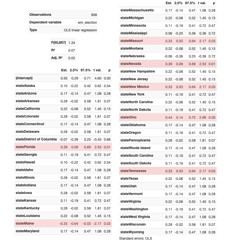
Some key takeaways from this model is that a lot of the significant predictive states are indeed the “key battleground states” that many analysts like to focus on: such as Florida, Maine, Nevada, and Ohio. This makes sense, considering that these states do not solidly lean one way or another and sometimes do end up deciding which candidate wins by a close margin. In the most recent 2016 presidential election, FiveThirtyEight predicted that Clinton would win Florida, but they also gave Florida the highest chance of tipping the election at 17.6%. After the ballots were counted, Florida was one of the states that tipped the electoral college in Trump’s favor.
Another thing to note in this model is that Maine, Nebraska, and the District of Columbia appear to have a negative coefficient, which may initially suggest that winning these states decreases the chance of a candidate in winning the election. However, these coefficients are misleading because Maine and Nebraska have a split vote system as I mentioned previously. Also, the 95% confidence intervals include a positive value for both Nebraska and DC, showing that it could also predict a winning candidate.
So, the people who are pushing to abolish the EC do have a valid argument. The model here provides some evidence that the EC tends to give more importance to these “battleground states” in terms of electing the President of the United States.
Swing States
In the final part of my introduction data exploration, I’ll be looking at how states swing between each presidential election from 1972-2016. I chose to start my data with the 1972 election because the data for many elections before that had some issues with the data as I mentioned briefly earlier.
The formula I used to calculate how much a state swings between each election is:
\[\frac{R_{y}}{D_{y}+R_{y}}-\frac{R_{y-4}}{D_{y-4}+R_{y-4}}\]
where \(R\) is the number of popular votes that the Republican candidate received for an election year \(y\) and the last election year \(y-4\) and \(D\) is the same but for the Democratic candidate.
The resulting map displays how much each state swung on a scale from -0.5 to 0.5 where negative values represent a shift in favor of the Democratic candidate and positive values for the Republican candidate. In recent elections, we see a general shift in favor of Obama in 2008 and then a smaller general shift back towards the Republican side in 2012 and 2016. Between 2012 and 2016, Utah voters shifted the most, swinging first to support their home state candidate, Romney, in 2012 and then shifting back towards the Democratic side in 2016. One thing to note is that these “swings” are referring to how the total number of votes for each party change between general elections. They are not referring to any specific voter.